Blogs & News
R for Researchers: 8 essential cheatsheets for research data analysis

Hi, and welcome back to the final instalment in my series looking at using R for research and the wealth of resources that are available to help you get started. My first post on R for researchers covered why you should be using R to perform data analysis, while the second looked at the unique things to consider when working with R in AnalytiXagility. This final post covers useful cheatsheets that will help you to use some of the more common and useful R packages available.
One of the great advantages of using R is the fact it is open source and has a large community of users, which means that most of the time someone will have already tried to achieve your analysis goal on a different dataset. There are over 10,000 packages and pieces of example code easily accessible online to help you perform your analysis more quickly and easily. There’s no point in reinventing the wheel!
There are some great R resources for beginners, including the CRAN website and introductoryr. However today the cheatsheets I’ll be covering for general use of R in data science are from datasciencefree.com and RStudio.
The first two are from datasciencefree.com; R and Advanced R cover a wide range of general topics, from data structures and manipulation to creating functions, data munging and environments. These were certainly my first port of call for any general R questions I had while learning, and the general principles and conventions found in them will take you a long way. While these are succinct “memory-joggers” for when you have forgotten how to do something, an unknown term can provoke a quick search, discovery of a new feature, and expand your repertoire!
The following cheatsheets are from RStudio’s Resources centre, and offer a more in-depth look at using a range of specific packages effectively.
Data visualisation with ggplot2
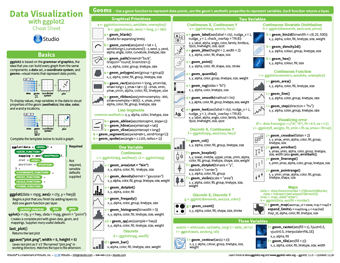 One of the most popular and commonly used packages for data visualisation within R is ggplot2. It’s based on the grammar of graphics, which is the idea that any graph can be built from the same basic components: some form of data, a coordinate system, and geoms – visual representations of data points. ggplot2 provides a consistent and powerful way to map these three components of a graph into an integrated whole. The cheatsheet may initially look intimidating, with an overwhelming amount of information for the novice, but this is only reflecting the huge level of customisation found within the package. It has been developed to quite a mature stage, which means a lot of parameters will default to sensible values if left blank, leaving you to only use the parameters you need to produce the graph you desire.
You can also take a look at our ggplot2 technical tutorial – this gives an in-depth run through with examples and is helpful for those looking for more detail than the cheatsheet provides.
How big is your graph?
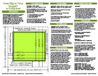
This covers the various issues that arrive when defining any graphic size and position using the knitr package. While this cheatsheet uses knitr to define graph size, this package can also be used to define R markdown document layout as detailed in our working with files user guide.
There are many features of graph size and shape that can be considered and defined such as size of graphics device, plot margins, multiple panel placement and font size. All the arguments used to define these properties are covered in this cheatsheet, enabling an easy reference for when you want to get your graph layout just right.
Data import with readr, tibble, and tidyr
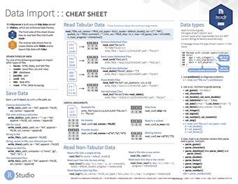
These packages are built around the principle of “tidy data”, with every variable having its own column, every observation having its own row, and every type of observational unit forming its own table. This relationship between data and the structure in which it is held makes analysis far simpler and more robust. Tidy data makes it easy to access variables as vectors, while preserving cases during vectorised operations. This principle is a good practice for many other packages, including ggplot2 mentioned above.
This cheatsheet shows the various read, write and data parsing functions of readr that can read text data into R, and then how to layout tidy data with tidyr and create tibbles with tibble. A tibble is a nice way to create a data frame, that encompasses best practices for data frames, such as never adjusting variable names and never using row names. The use of tibbles makes life far easier for a data scientist to get their data into a tidy and easily readable format.
R for Data Science is the online version of the popular O’Reilly book published in January 2017, and is well worth reading to understand the basics of the tidy data approach. The book goes on to talk about modelling using tidy data, and while there isn’t a cheatsheet available for modelling using tidy data yet, this book covers the packages used.
Data transformation with dplyr
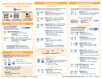
The first thing to mention with dplyr is that it only works with tidy data, so before attempting any manipulations within this cheatsheet, make sure you have used tidyr or other packages to tidy up your data. Once tidy, this cheatsheet shows how you can use this package to summarise cases, group cases, manipulate variables, combine tables and apply vectorised functions. Not only can dplyr perform these actions on data within R, but it can also connect to remote databases by translating your R code into the appropriate SQL, allowing manipulations to be performed within the R console.
Distributed machine learning in Spark with sparklyr
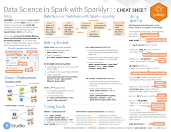
This covers the use of the sparklyr package to provide an R interface for Apache Spark, an engine for large-scale distributed data processing. Sparklyr provides a complete dplyr backend, enabling researchers to interact with their cluster using familiar R code to run machine learning algorithms on distributed workstations. This is a more advanced cheatsheet and package, but even if you don’t wish to use it in the near term it is good to know the huge capability and extensibility of R. Even a package as complex as this can be boiled down into a cheatsheet!
Survival plots with survminer
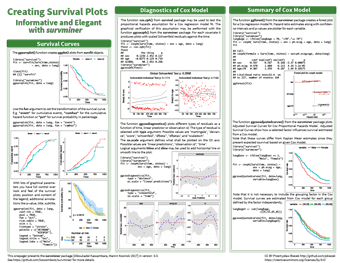
With longitudinal data, it is common for researchers to want to produce survival plots and run Cox regression models on that data. Producing the correct graphs in an elegant way for these analyses from the survival analysis package survfit can be tricky, but there is, of course, a package to help with that. Survminer allows creation of ggplot2 graphs with full control over the look and feel of the plot, as well as plotting the residuals from Cox regression analyses in the same fully customisable way.
This cheatsheet covers the many parameters that can be changed within the survminer package, as well as the distinct functions that can produce plots from different survival analyses. Using survminer speeds up the production of customisable, professional-looking graphs from your analyses, and this cheatsheet speeds that process up further still.
Eurostat package for accessing open data in Eurostat database
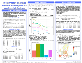
The Eurostat database contains a wealth of historic demographic data on European countries covering everything from economy and finance to transport, agriculture and social conditions; eurostat enables the search of this database and the download of individual tables for analysis in R.
This cheatsheet covers using eurostat to download a table from the database and plotting various variables to probe this data. Of particular interest is the combination of eurostat and maps, which enables a variable (e.g. fertility rate) to be plotted on a map in a cartogram to show the geographical distribution of this variable. The ability of R to easily pull in data like this from multiple sources and combine it is one of its key strengths.
Interactive Web Apps with shiny
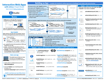
RShiny is a package that allows R to be used in a reactive form as a web app. A user can manipulate the web page by buttons, sliders and inputs, which become inputs for the server-run section of code. This reactively recalculates the outputs and outputs them in a way determined by the code written. This simple idea allows powerful apps to be developed, prototyped and hosted by anyone who can write in R.
This capability is so powerful that we have embedded R Shiny hosting into AnalytiXagility, enabling you to create and host your own interactive mini-apps within your workspace. This ability has been used by our data scientists to visualise models reducing hospital readmission rates, create a novel interactive visualisation of genomic data and an interactive map of prescribing data to help visualise geographical cost discrepancies. There are many more examples of these mini-apps being used by Aridhia’s research clients including the European Prevention of Alzheimer’s Dementia Consortium and CHART-ADAPT, a multi-partner collaboration advancing research and treatment for patients suffering from traumatic brain injury.
The cheatsheet gives a good overview of Shiny structure, how to build an app along with the various inputs, outputs and layout options, as well as extensive information on building an app. In addition, our own user guides can help you add dynamic UI elements to your apps, create animated time series charts, and keep your code modular to simplify app development for later re-use.
This cheatsheet roundup is by no means exhaustive; there is a huge amount of information out there and the main barrier to its use is being daunted by the sheer amount! I hope the summaries I have outlined are helpful, but even if not they inspire you to go looking for the solution you need – if not, feel free to drop us a note in the form below and we’ll be happy to help.