Blogs & News
Visualising Genomic Data with AnalytiXagility
Tomorrow I’m heading to Glasgow to attend the Next Generation Sequencing 2015 event, where Aridhia’s CTO Rodrigo Barnes will be talking about industrialising genomic annotation for clinical service delivery. As I’ve been preparing for the event, I’ve been processing three main thoughts, the first of which I want to concentrate on here:
- Multidisciplinary research accelerated by collaboration
- Translation accelerated by the ability to rapidly prototype
- Delivery into operational practice at scale.
This combination of innovation, prototyping and diffusion is key to industrialising genomic annotation, a sequence of events which begins with enabling and accelerating multidisciplinary research.
AnalytiXagility has always been more than simply a data safe haven for collaborative working; it has been designed to provide data innovation workspaces that give our customers a secure location and the built-in tools, such as R, Hadoop and MADlib, needed to collaboratively research and create informatics solutions that can then be translated and distributed into operational practice.
I want to concentrate on some particularly interesting enhancements for enabling multidisciplinary teams to rapidly visualise data and prototype research ideas which will be provided in AnalytiXagility’s next release (coming soon), which are of particular interest when analysing genomic data.
We’ve developed AnalytiXagility to make it easy for any user to work interactively with the data, creating rich and impressive visualisations in surprisingly little time. For a researcher skilled in R, it only takes a few hours to explore the data, produce a number of high-quality interactive plots, and share the ideas generated across multidisciplinary teams. Research involves subject matter experts as well as data scientists, and we were looking for a way to bring them closer to the analysis. At the same time there’s an opportunity to use the environment for prototyping before investing in new app development, for example.
We’ve been calling this new functionality “mini-apps” because they can start as truly small applications such as a histogram or tabulation, then be expanded to include bigger data and additional parameters to view the data from a number of angles.
AnalytiXagility already offers an R console, in which publication quality PDFs can be produced using graphical tools available in R, however the ability to now produce interactive visualisations is a great step – not least for bioinformatics developers who are keen to visualise large genomic data sets in a simpler and more appealing fashion.
The Variant Call Format (VCF) file is used for recording genetic variants when found at coordinates across a patient’s chromosomes. The VCF file is a key file type in bioinformatics pipelines for understanding patient genetic variability, but these files can be large and are not normally easy to navigate without a browser application. We’ve been working with this data structure through ongoing research projects at the Stratified Medicine Scotland Innovation Centre and last year’s work with Genomics England.
The new mini-apps prototyping module provides a suitable environment to quickly transform VCF data into custom interactive visualisations. This makes it easier to perform preliminary QC analysis and begin the process of interpreting genetic variations. Figure 1 provides a quick representation of a VCF file, at the intersection where the header or metadata section ends and the variant data, which is tab-separated, begins.
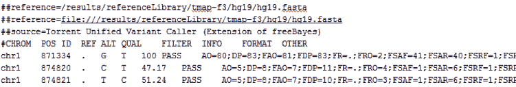
Figure 1 – A snippet of a VCF file, effectively a tab-delimited file including a metadata header section
Figure 2 shows a couple of ideas for mini-apps, a Circos style plot and a density distribution of mutation rates from VCF data, plotted using ggplot2 and ggvis R packages, respectively. The really interesting part is doing this inside an interactive “Shiny by RStudio” environment, which the new mini-apps functionality is based on. Bioinformatics developers at Aridhia have produced a number of example mini-apps, also including an intuitive interface app for viewing the whole VCF file, browsing, sorting and navigating key variants, which can then be linked out directly to the Ensembl website. This allows the researchers to truly see the variants alongside detailed annotation information. We have used Ensembl as an example in this particular example, however various URLs could be linked in order to facilitate variant interpretation.
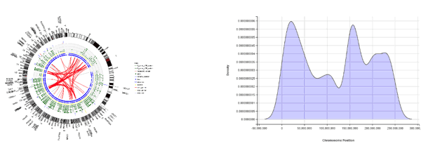
Figure 2 – Circos-style representation of pancreatic cancer genes; SNP densities across chromosomes
As mentioned, mini-apps are quick to build, as they’re based on the Shiny framework. As a team we’ve certainly seen an immediate productivity increase, particularly in terms of the quantity of questions that can be answered from a single visualisation app.
AnalytiXagility gives users the major packages for bioinformatics analysis and plotting data using R, including Bioconductor packages. This specialism means the bioinformatics development efforts are strongly supported; we are now able to share richer analyses and keep the data safe in accordance with IG requirements, while also ensuring that you can share your analyses with non-specialists in easy to digest visual formats.
This post has just been a quick pointer to what’s possible in a relatively short timeframe using the new AnalytiXagility mini-apps feature, and we’ll share more detailed examples on what’s possible in the coming weeks.
If you are attending the NGS Glasgow Conference this week, please come to Aridhia’s stand and ask for a demo. We’re looking forward to sharing further ideas, getting some feedback and trying out some more examples together.