Blogs & News
Helping Intensive Care Teams at Great Ormond Street Hospital to Navigate Data
The cardiac department at Great Ormond Street Hospital (GOSH) hold weekly meetings to discuss the activity in the department and any surgical complications which may have arisen the previous week. These meetings are crucial for operational management and patient safety. ![]()
Using the Digital Research Environment (DRE) platform, data scientists at GOSH collaborated with clinical and analytical teams to develop a dashboard that automatically collated and visualised key metrics required for these meetings.
The project was able to source the data, which was previously collated from doctors’ notes, in structured form which were extracted in the form of the DRE’s research data views (RDVs). 11 of these RDVs are used in the project, with the data joined in various ways to create the key metrics presented in clinical team meetings.
The Dashboard
The dashboarding app is a browser-based application hosted in the secure Aridhia DRE. It has interactivity built in which means users can explore the data, for example by filtering and selecting subgroups. As a specific case: the number of ward admissions and discharges can be filtered based on what ward the user is interested in looking at.
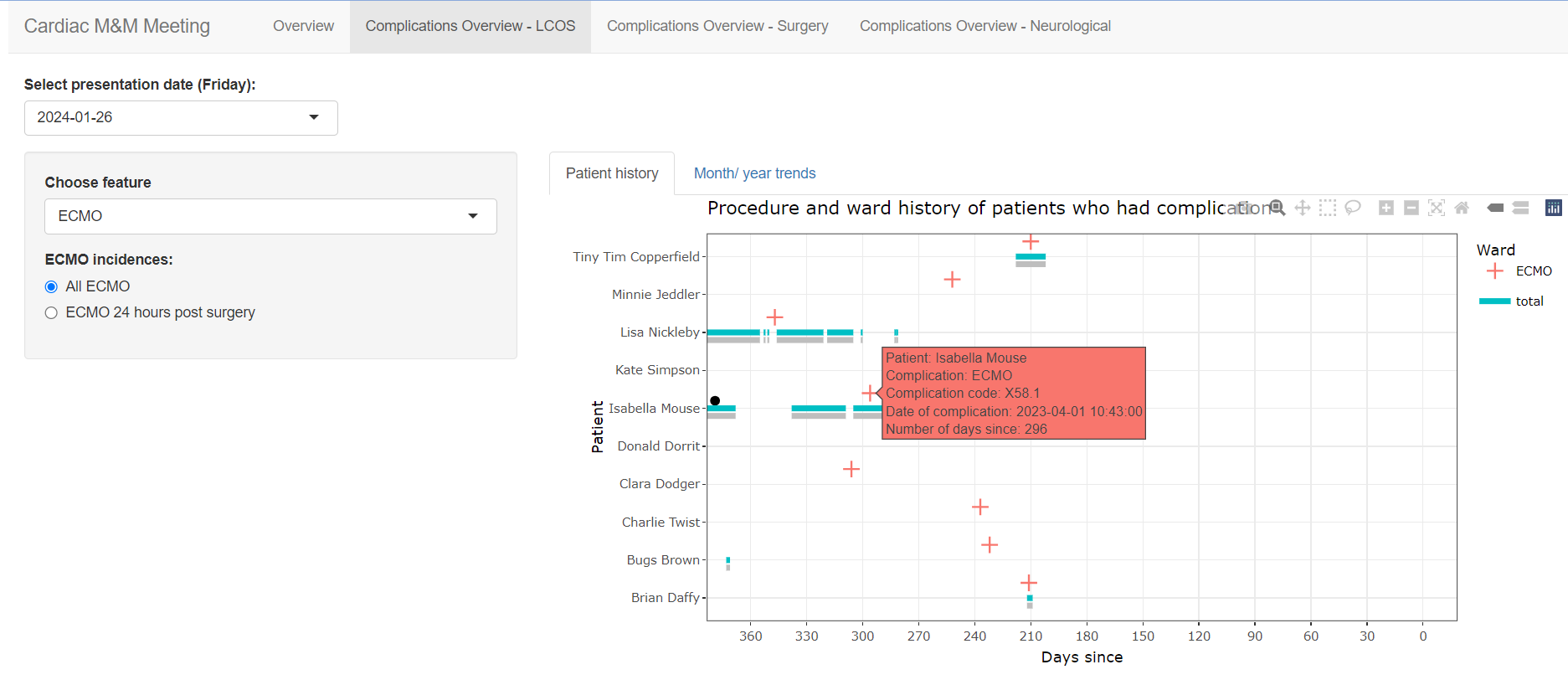
An example screen of the cardiac dashboard. The data featured here is dummy data for presentation purposes.
“The quick replies and approachability of the cardiac department and analysts was beneficial in progressing the project as I could sense check the app outputs. In turn, the clinical team are really pleased that the dashboard can help enable them to get the most out of health information that is routinely collected to advance care.”
Key features are automatically presented in clear and concise visualisations and tables. For example, patient level ‘timeline’ plots where all relevant patient history including their admissions, cardiac ward stays, procedures and complications are tracked through time to present day.
Through automating the data extraction process and using our analytics pipeline for development, it is estimated to save ~10 hours of analyst time compared to the time it takes to manually curate the information. By developing data visualisations which detail a patients’ procedure and complication timeline, we hope we have been able to bring more useful information together and present it all in one place which can aid patient care discussions.
The behind-the-scenes workings of the app have been developed in a way to allow for additional features to be easily incorporated. The project has been deliberately coded in a generalised and reproducible manner which means that the visualisations we have created can be used for other projects. This means we can do similar analyses for different departments and specialties at GOSH.
Find out more about the GOSH DRE.