Blogs & News
The Use of Run Charts in Health Informatics
What is a run chart?
Run charts are used in analytics to identify and display trends in data over time. Plotting a run chart can determine the effect of an implemented change. When plotting a run chart:
- The x-axis in a run chart represents time series.
- The y-axis is the observed data, typically this metric is count, rate or proportion. Ideally, a minimum of 15 points are required to plot a run chart.
- The central point (CP) in a run chart is the median; the CP acts as a baseline, with data fluctuations around this point revealing anomalies.
Special Causes
The following observations from a run chart can be used to characterise behaviour; these are called special causes:
- The shift rule is defined as six or more consecutive points above or below the CP line (not ON the CP line) [1].
- The trend rule is defined as five or more consecutive points either increasing or decreasing in one direction [1]. A trend can cross the CP line.
- The astronomical point rule is used to catch extreme outliers; defining this relies on judgement and an understanding of the data [2].
- The run count is a series of points in a row on one side of the CP line. This can be calculated by counting the number of times a single line between points crosses the CP line and adding one. A six sigma reference table declaring the upper and lower counts of the expected run count can be found in the references [3]. If run count is outwith the limits described in the six sigma reference table then this indicates that the data contains special cause variation.
Run Chart Analysis
One of the limitations of using the CP line of the entire median on continuous data is that future changes in behaviour can skew the median and so methods used to characterise behaviour can be masked. One way to keep the chart sensitive to change when analysing continuous data is to consider the initial median only, and use this as a baseline against further data. However for this to work, the initial data must be stable. The number of data points to consider for the initial median is dependent on the dataset. Once an initial median baseline (CP line) is established it is frozen, therefore any changes stand out against initial data.
Limitations
Run charts cannot determine if data is stable [4]. Data on a run chart might look stable, but if plotted on a control chart (for example, a Shewart chart), could reveal special causes. Control charts differ from run charts in that the CP line that is used to distinguish special causes is the mean and not the median. If 50% or more data on a run chart represents the absolute and extreme values then the criteria for detecting a non-random statistical sample cannot be applied. Run charts require judgement and understanding of the data.
The use of run charts in health informatics
Background
Government targets for waiting times in Accident and Emergency (A&E) serve as a driver to improve the operational efficiency of A&E departments. NHS England provide a weekly data snapshot of operational performance that is freely available to the public [5]. In response to public interest, media organisations provide regular analyses of these open data which can serve to drive the news agenda [6]. This reporting is mainly limited to descriptive statistics of the aggregate data, with no statistical inference or consideration of confounders. Greater analytical insight and commentary is available elsewhere, however the associated time lag in producing these reports means that:
- They are less relevant to the current situation.
- The analysis is limited to national-level data [7,8].
In order to respond effectively to the news agenda, stakeholders must have an effective way to visualise and interpret contemporaneous data and tailor this analysis to their needs, for example to reflect changes in national policy or local context.
Methods
Run charts are a type of statistical process control method that is often used within healthcare quality improvement initiatives [9]. A run chart was developed using the R console in the AnalytiXagility platform and ggplot2 to automate the process of visualising weekly A&E admission data. Local or national data can be used and timescales can be amended to suit user preference. Tailoring and annotation of the run chart by users enables the assessment of targets and initiatives (either local or national). For the purposes of this post, the run chart has been annotated with a target of 95% adherence to the 4 hour waiting time (black horizontal line); the median or centre point of performance (red horizontal line); the timepoint where a hypothetical waiting time initiative was implemented (blue vertical line); and a hypothetical time period of interest (green transparent area).
Results
The resulting run chart is displayed below:
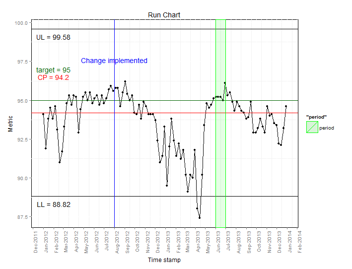
From this we can infer the following:
- The centre point line (94.2%) is below the target (95%), which indicates that most of the time the target is not being met.
- Waiting time performance improved in the summer months where the target was either met or exceeded.
- After the hypothetical change implemented in July 2012, levels fluctuate around the target level, followed by a downwards trend, reaching the lowest point in April 2013.
- During the hypothetical period of interest (June 2013), waiting times are relatively constant. Following the review waiting times increase as highlighted by the decreased percentage meeting the 4 hour waiting time.
Discussion
The NHS Plan published in 2000 stated that “by 2004 no-one should be waiting more than four hours in accident and emergency from arrival to admission, transfer or discharge” [10] but it was subsequently acknowledged that clinical exceptions made this 100% target unachievable. In 2003, an interim milestone was set at 90%, with the aim to achieve a final target of 98% [11]. A combination of additional resources and financial incentives resulted in improvements towards meeting this target, despite a steady rise in attendance rates. In 2002/3, 77% of patients were seen within four hours, improving to 97.7% by 2007 [12,13], although healthcare professionals expressed concerns that patient safety was being put at risk as a result of these waiting times initiatives [10]. Owing to difficulties in sustaining the 98% target, a reduction to 95% was announced in June 2010 with immediate effect [14], resulting in a subsequent drop in the average operational performance to around 95% [8].
Conclusion
Using a run chart we have shown that over the past three years there has been a relatively wide variation in adherence to waiting time targets in A&E in NHS England. We have demonstrated how these data can be collated into an easy to interpret format and how annotation can aid interpretation. Perhaps of greatest value is that fact that this analysis is based on an automated summation of contemporaneous data in a format that is easily interpretable to those with a limited knowledge of statistical techniques. The ever-shifting political and healthcare landscape demonstrates the need for an iterative approach to such analyses and the need to allow users to tailor information to their own requirements.
References
- Scottish patient safety program. Good Practice Guide Data Management run chart rules [internet]. 2009.
- NHS Scotland. Quality Improvement Hub [internet]. 2012.
- MiC Quality. Six Sigma Reference Table [internet].
- NHS Wales. The run chart: a simple analytical tool for learning from variation in healthcare processes [internet]. 2011.
- BBC News. NHS in England “misses A&E target” [Internet]. 2014 [cited 2014 Jan 17].
- The Nuffield Trust and The Health Foundation. How long should patients expect to wait in A&E [Internet]. QualityWatch. 2013 [cited 2014 Jan 17].
- Woodcock T, Poots AJ, Bell D. The impact of changing the 4 h emergency access standard on patient waiting times in emergency departments in England. Emerg. Med. J. [Internet]. 2013 Mar 1 [cited 2014 Jan 17];30:e22.
- Perla RJ, Provost LP, Murray SK. The run chart: a simple analytical tool for learning from variation in healthcare processes. BMJ Qual. Saf. [Internet]. 2011 Jan;20:46-51.
- Department of Health. The NHS Plan. A plan for investment, a plan for reform [Internet]. 2000.
- Department of Health. Clinical exceptions to the 4 hour emergency care target [Internet]. 2003.
- Department of Health. Transforming emergency care in England [Internet]. 2004.
- Department of Health. Archive – Total time spent in Accident and Emergency [Internet]. 2013 [cited 2014 Jan 17].
- British Medical Association. BMA survey of A&E waiting times. 2005.
- Department of Health. Revision to the Operating Framework for the NHS in England 2010/11 [Internet]. 2010.