Blogs & News
Analytics Essentials: Improving Your Data Quality
Profiling your Data
Why is data quality important?
Before starting to do any analysis it is really important to ensure that your data is in good condition and also to have a good general overview of your data before you start. We may want to know the answers to questions such as:
- How many rows and fields are in my dataset?
- How many fields are largely composed of NULL or missing values?
- What are the different data types?
- What are some of the sample values for fields that I need?
- Are there outliers in the data?
- Has data been recorded accurately? (for example dates)
- Can the data be linked to other sources?
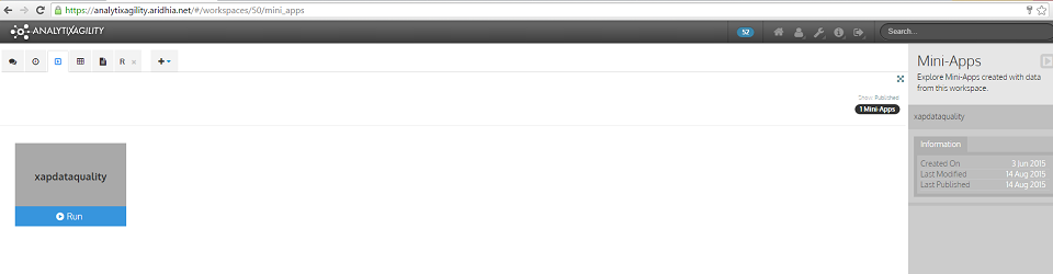
Aridhia has developed a data quality mini-app which will help you to answer these questions. This mini-app is available to users within each AnalytiXagility workspace. To access it, simply navigate to the mini-app page where it will appear as a published mini-app, then just click Run to execute it.
Using the data quality mini-app
The data quality mini-app can be used to generate a data profiling report on any dataset which has been loaded into the user’s AnalytiXagility workspace.
It takes an input of a dataset and returns a PDF containing sections on data linkage, data volumes, data definition, data ranges plus data quality and completeness.
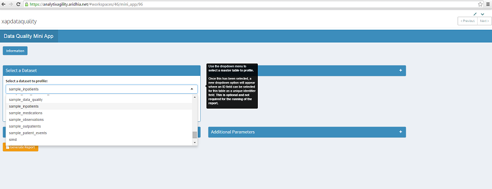
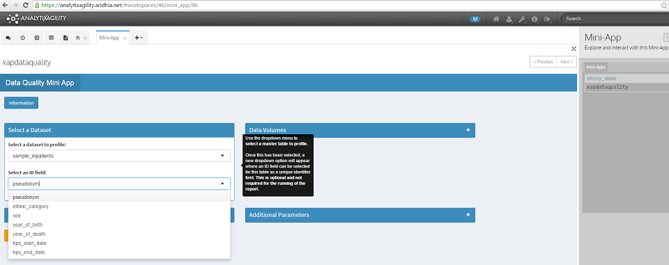
Here we will select the dataset sample_inpatients (this is a sample dataset which I have created).
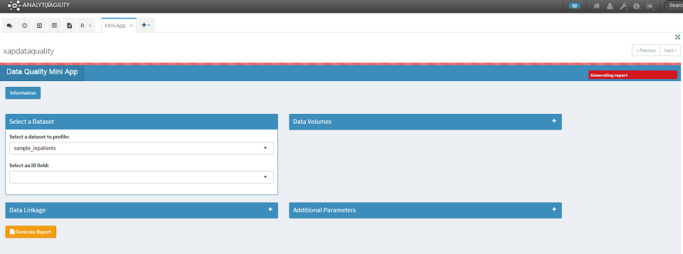
To generate the report, simply click on the Generate Report button at the bottom left of the screen. A red progress bar indicates that the report is generating.
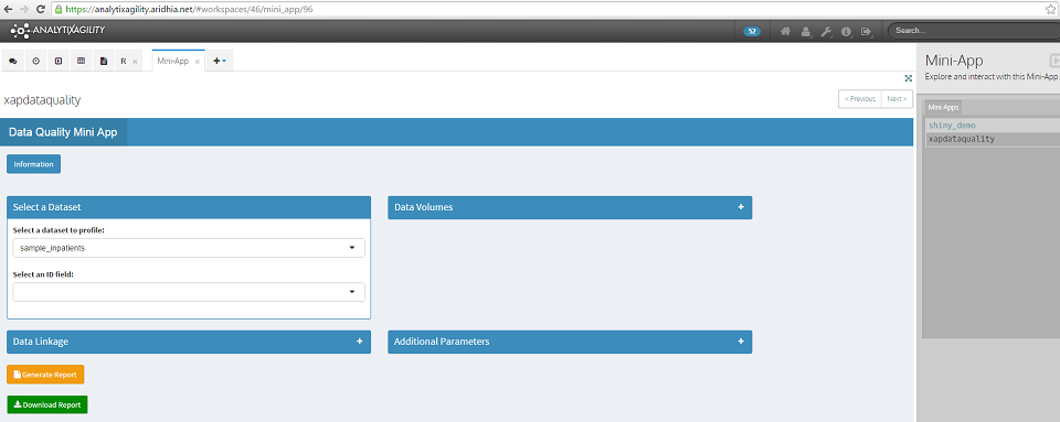
Once the report generation is complete, a green Download Report button will appear. Click on this to download and save the report.
The default report contains sections on data volumes, data definition, data ranges and data completeness. The output for each of these sections is explained below.
1.Data Volumes
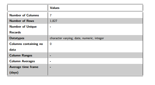
Figure 1: Data Volumes
The data volumes section details that sample_inpatients has 7 fields and 1,996 rows. The fields in this dataset are composed of 4 different types: character varying, date, numeric and integer. There are no fields in this dataset which contain all NULL values.
You can see that some of the entries in this table are not populated (Number of Unique Records, Column Ranges, Column Averages and Average time frame (days)). These fields can be populated from the Data Volumes section in the mini-app, which we will return to later.
2.Data Definition
This section details the columns of the dataset, plus their meta data type. For each field, up to three sample values will be displayed. It is worth noting that these samples are completely random across the dataset. If there are more than three distinct values for a dataset field, a random selection of values will be displayed each time that the report is generated. If the number of distinct values is less than or equal to three, the same values will be displayed each time.
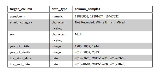
Figure 2: Data Definition
3.Data Ranges
This section details data ranges (min, max, mean, median, std.dev) across the dataset for numeric and date fields.
For the numeric data ranges, if an ID field was selected on the mini-app, it would not be included in Figure 3 below.
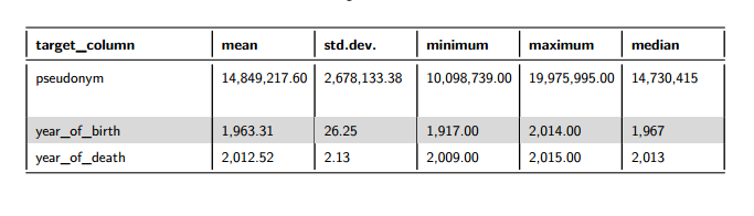
Figure 3: Data Ranges for Numeric Fields
Box plots are used in this section to detect numeric fields which may contain outliers. The thick black line in the centre of the box plot represents the median – the area beyond this line represents the top 50% of the data. The notches on either side of the median represent the 25th and 75th percentiles respectively- the inter-quartile range of the data is enclosed within these notches. The horizontal lines or ‘whiskers’ stretch to the minimum and maximum points of the data. The red dots denote the lower and upper outlier boundaries (lowest or highest value within 1.5 times the inter-quartile range from the lower or upper notch). If either red dot is lying on the whisker it suggests that there may be outliers for that data field – the minimum or maximum data point lies outside the outlier boundary.
We can see that for the numeric fields in this dataset, the red dots are not lying on the whiskers, suggesting that there are not outliers in this data.
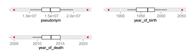
Figure 4: Box Plots
For date fields we look at the minimum, median and maximum. This will highlight any dates which may have been recorded incorrectly as being greater than today’s date.
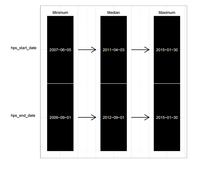
Figure 5: Data Ranges for Date Fields
4.Data Quality
This section returns data quality information for the dataset, looking at the number of distinct values and the percentage completeness for this field. If the field is greater than 80% complete, then green; if the field is less than 50% complete, then red; otherwise amber for average completeness.
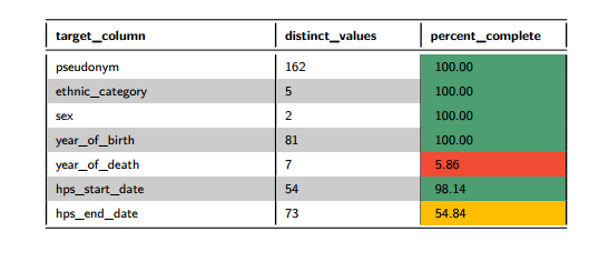
Figure 6: Data Quality Table
We can see that for sample_inpatients that a couple of fields have been flagged as being poorly populated. These are hps_end_date, which is approximately 50% populated and year_of_death, less than 10% populated. It’s very important in any analysis to take missing data into consideration, results can appear misleading otherwise.
What else can be included in the report?
Additional Data Volumes
Once a dataset has been selected, we may wish to select an ID field which will be a unique identifier field. We can select this ID field from all the fields that are in the selected dataset. This is optional but will allow us to find additional information such as the number of unique rows in the table, as well as to be able to use this for linkage.
To detect the unique ID field in the dataset being profiled, it may be useful to use the following figure which is presented in the data volumes section of the report. We are interested in the field which has the greatest percentage of unique values compared to the other fields in the dataset. In this case, it is the field pseudonym, so we will take this as the unique identifier field for the sample_inpatients dataset.
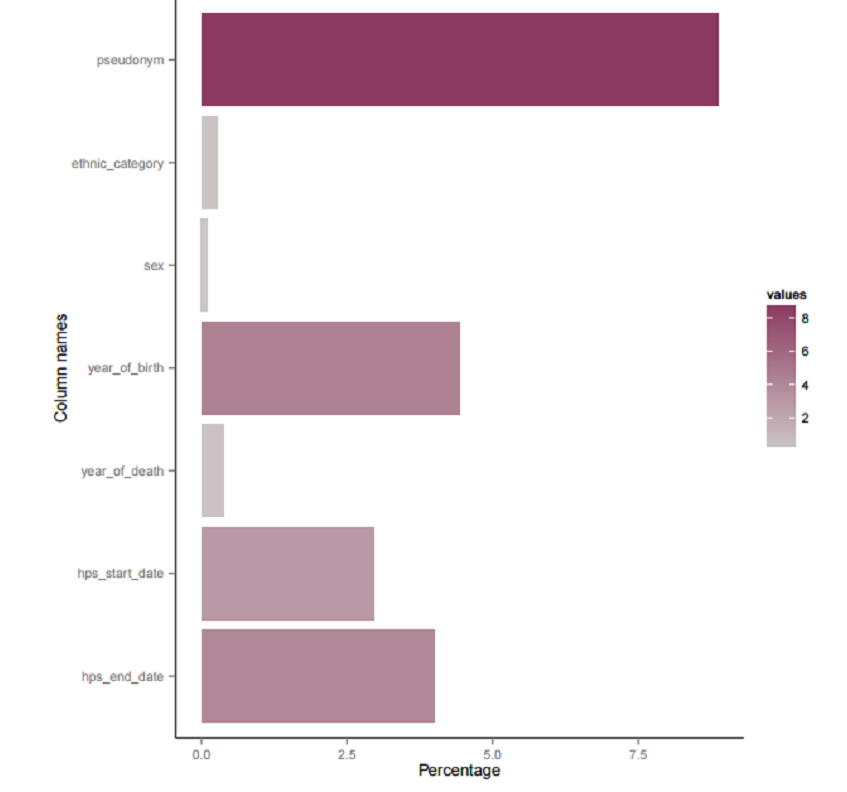
Figure 7: Percentage of Unique Values for Data Fields
The unique ID field for the sample_inpatients table is pseudonym.
We can choose further data volumes information to include in the report. If numeric fields are present in the dataset, drop down menus will appear to choose numeric fields whose range and/or average is required. This option will not be available if there are no numeric fields.
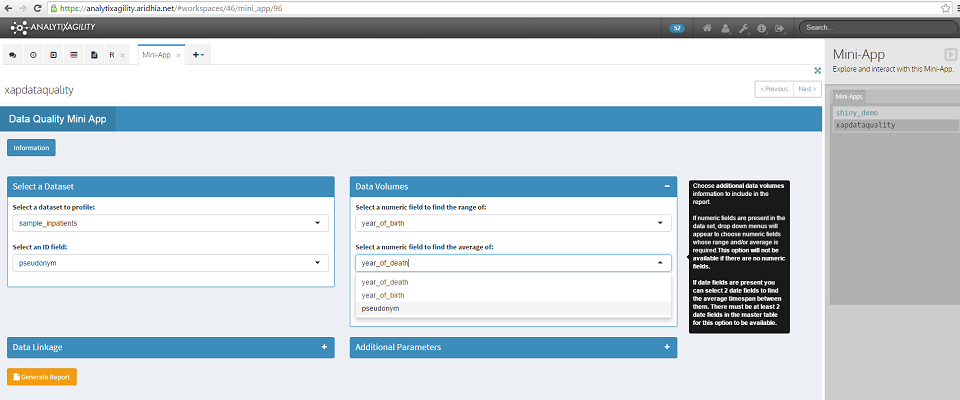
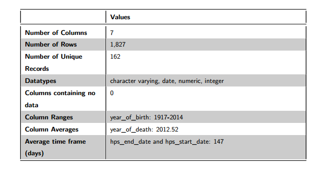
Figure 8: Data Volumes
Of the 1,827 rows in this dataset, there are 162 unique rows (based on the unique ID field of pseudonym). We can see that the field year_of_birth ranges from 1917-2014, the field year_of_death has an average of 2013 and the average time frame between hps_end_date and hps_start_date is 147 days.
Data Linkage
For the data linkage section of the report, we need to start with a master table which has a known ID field (this is the dataset and ID field that we have already selected). We want to find how good the linkage is between the master table and other tables that we select from the datasets which have been loaded into the user’s workspace. We need to know in advance what the unique ID fields are in these tables for linkage purposes.
To ensure the linkage section is included in the report, click TRUE, then choose the required datasets from the dropdown menu to link with the master table. Each time a dataset is selected, an additional option will become available to select the ID field for that dataset. We must select an ID field for each dataset that is selected.
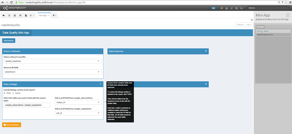
Here we have selected the additional datasets sample_observations and sample_outpatients to link with the master table, with unique ID fields of unique_id and pat_id respectively (again these are sample datasets which have been created for this purpose).
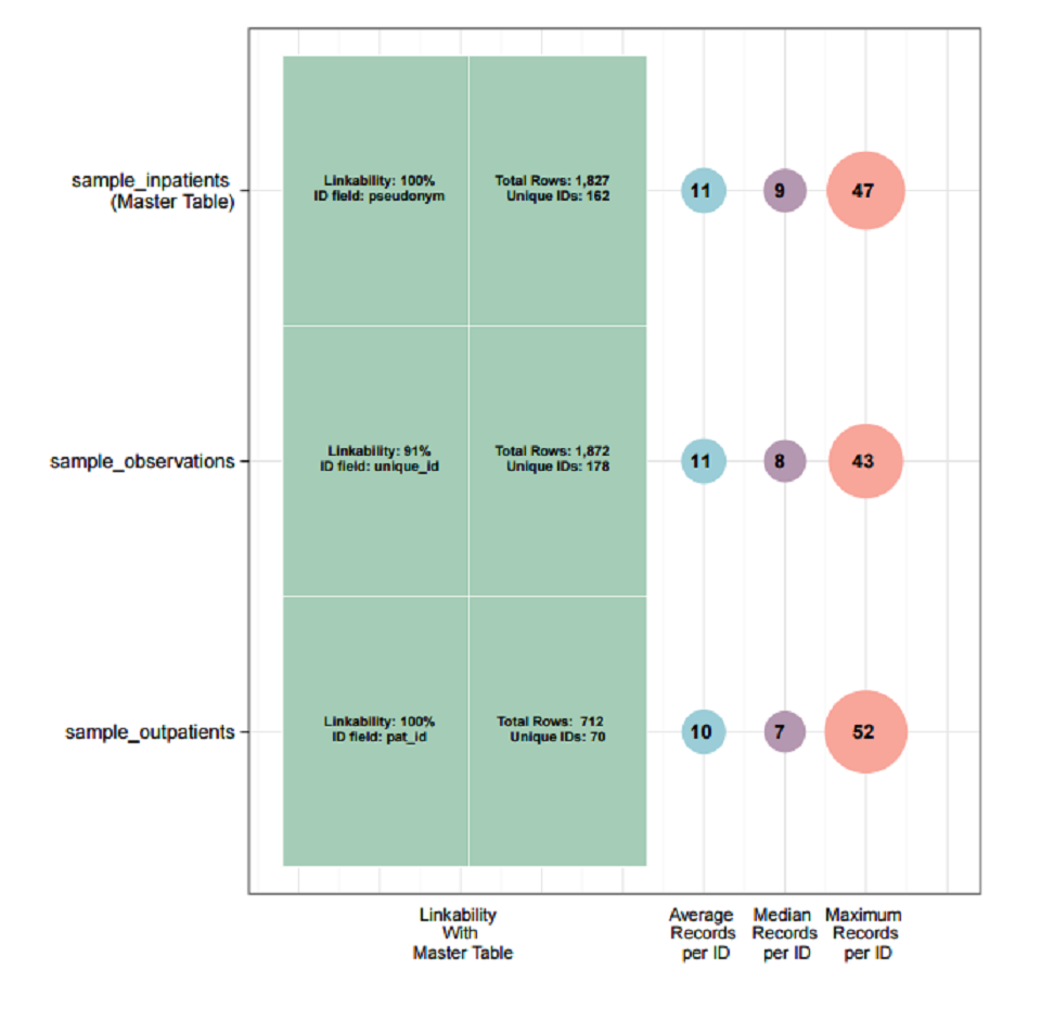
The resulting visualisation is displayed in the data linkage section of the report. The percentage linkability shown is the percentage of unique IDs in a dataset that can be linked with unique IDs in the master table. Here we can see that in the case of both sample_observations and sample_outpatients, 100% of the unique IDs can be linked with the unique IDs in the master table (sample_inpatients).
This visualisation also shows the average, median and maximum number of records for each unique ID. For example, the dataset sample_inpatients has an average of 11 records per unique ID, with one ID having 47 records.
Additional Parameters
There are a number of additional optional parameters that can be utilised when we generate the report.
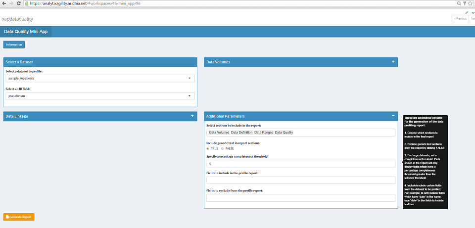
- We can choose which sections to include in the report. For example we may only wish to include the data quality section in the report.
- We can exclude generic text sections from the report by selecting FALSE. This will cut down the length of the report by only including the required tables and figures in each section.
- For large datasets we can set a completeness threshold. This means that any visualisations shown in the report which normally display all fields, will only display those which have a completeness threshold greater than the selected threshold.
- We can include/exclude certain fields from the dataset to be profiled. We can select these fields from the drop down menus.
Using this mini-app allows you to efficiently and accurately answer the questions posed at the start of this post, ensuring that your data is of the highest quality possible.